

A Mark That Grew Up
Published on
April 11, 2026
Published by
DEFT Content Team
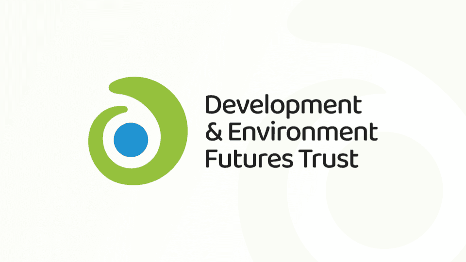
The Development & Environment Futures Trust (DEFT) has always been driven by a singular purpose: working across Odisha to empower communities through our 3E model Engage, Enable, Equip. Over the years, we have grown from our grassroots beginnings into a maturing institution. Today, we are thrilled to announce a new visual identity that reflects not just where we started, but who we’ve become.
Why the Change?
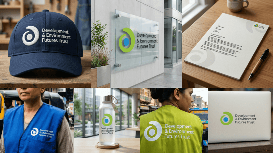
Our legacy mark served us incredibly well, but it was built for a different era. The original DEFT logo was detailed, illustrative, and designed primarily for print and formal documents. As our work expanded, we realized the old logo carried limitations it was too complex to scale across digital surfaces, small screens, and field materials. We lacked a standalone visual shorthand that could represent DEFT at a glance on a badge or a field kit.
Our evolution into a modern, field-ready organization required a new brief: create a mark simple enough to be easily understood, yet powerful enough to leave a lasting impact.
The Story of the Elements
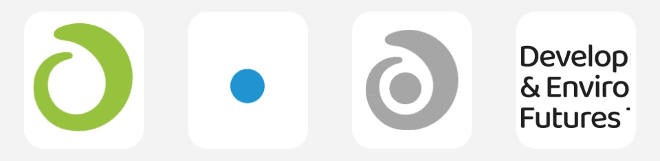
Our new logo is a clean, minimal icon that is fully scalable from a favicon to a billboard. Every piece of its geometry tells a story about our mission:
The Evolution Spiral (Green): The continuous "Apple Green" arc represents circular growth and our commitment to sustainable development. The green signals environment, care, and forward motion. It reflects our promise to "nurture" communities.
The Blue Core: At the heart of the mark sits a "Cerulean Blue" circle representing Earth—the very thing DEFT ultimately works to protect and sustain. This core serves as the visual "anchor" of our identity, symbolizing the vast, essential resources of our planet.
The Hidden "d": If you look closely at the negative space within the mark, you will see a lowercase "d". This clever design choice ensures that "Development" is literally baked into the geometry of the logo.
The Typography: We have embraced a friendly, geometric, and modern aesthetic. We paired this with a truly inclusive, multilingual font family that embodies our core message.
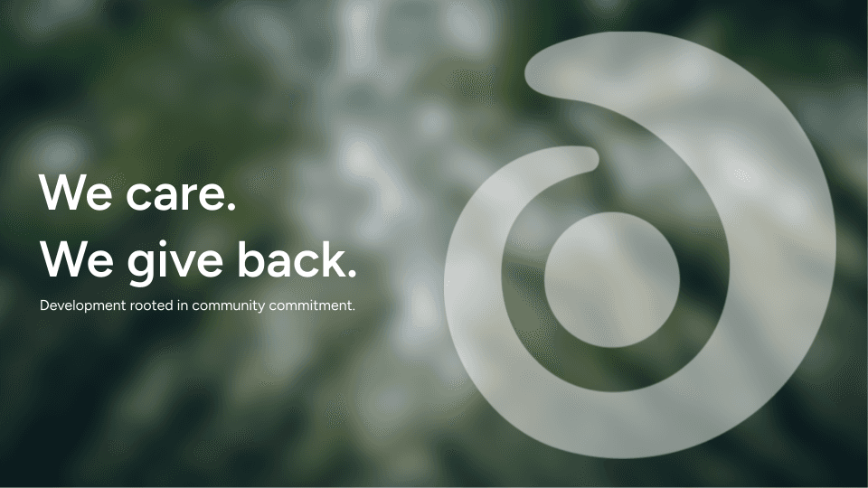
We Care. We Give Back.
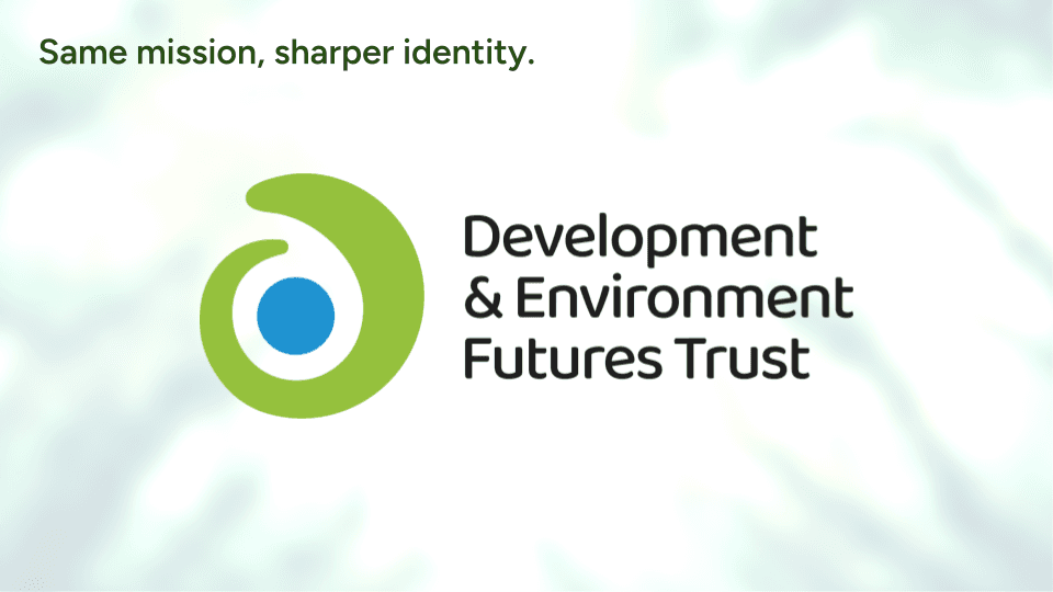
More than just a change in colors and shapes, this redesign is anchored by our guiding philosophy: "We care. We give back." This simple phrase captures the essence of our development model, which is deeply rooted in community commitment.
As we roll out this new identity across our digital platforms, print materials, and field kits, one thing remains unchanged: our dedication to our work. It is the same mission, just with a sharper identity.
Welcome to the new DEFT.
The end! Thanks for reading!

